To maintain a unified visual identity, the University employs a structured typographic system. This hierarchy ensures that all communications—from institutional diplomas, certifications, to social media posts—carry the distinct identity of ISU.
1. Identity Typefaces (Logotype & Mantra)
These are reserved for the official branding and should not be used for general body text to preserve the integrity of the logo.
ISU Seal Text: Arial (Bold)
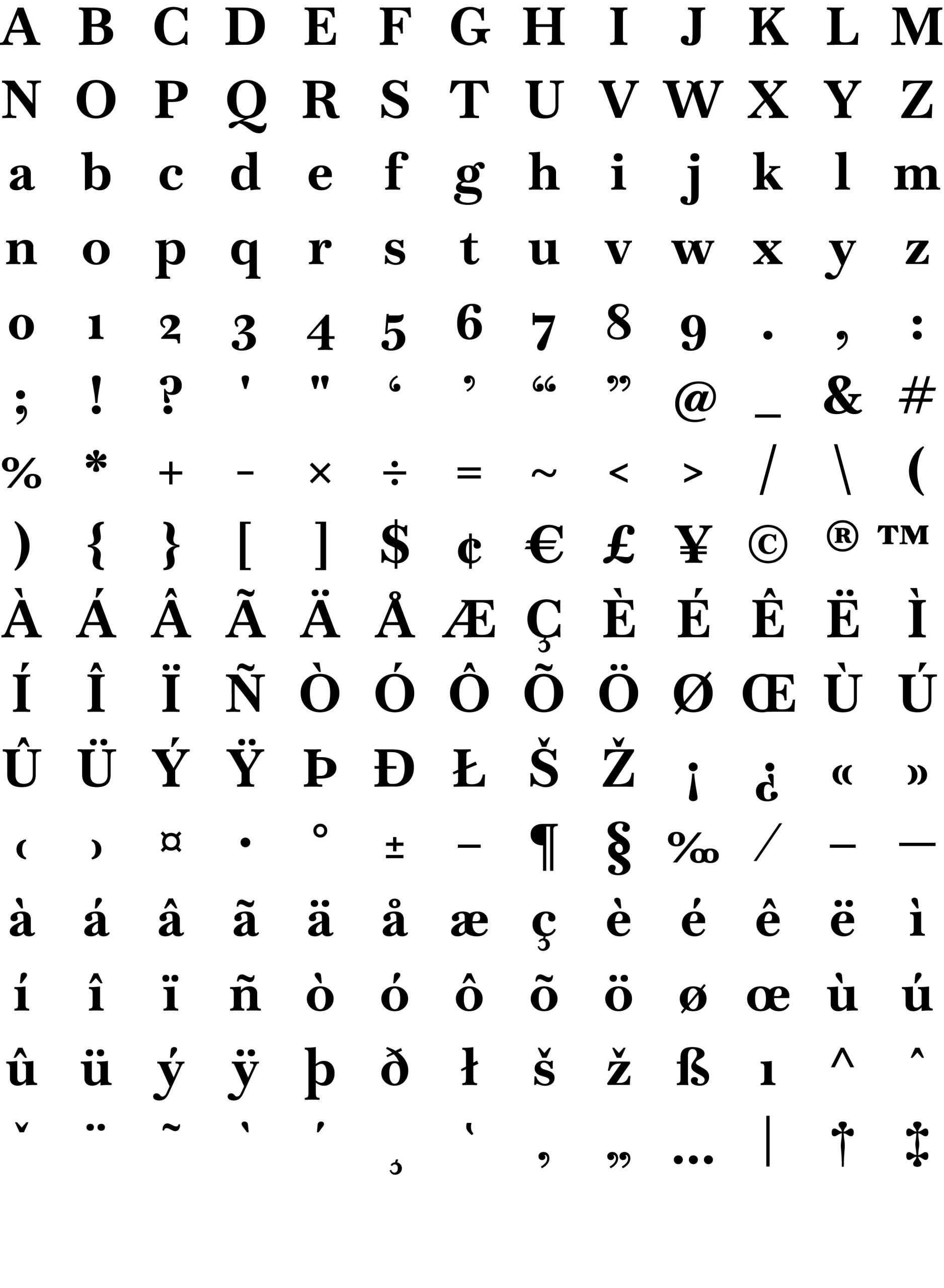
ISU Logotype: Baskervville (Bold)
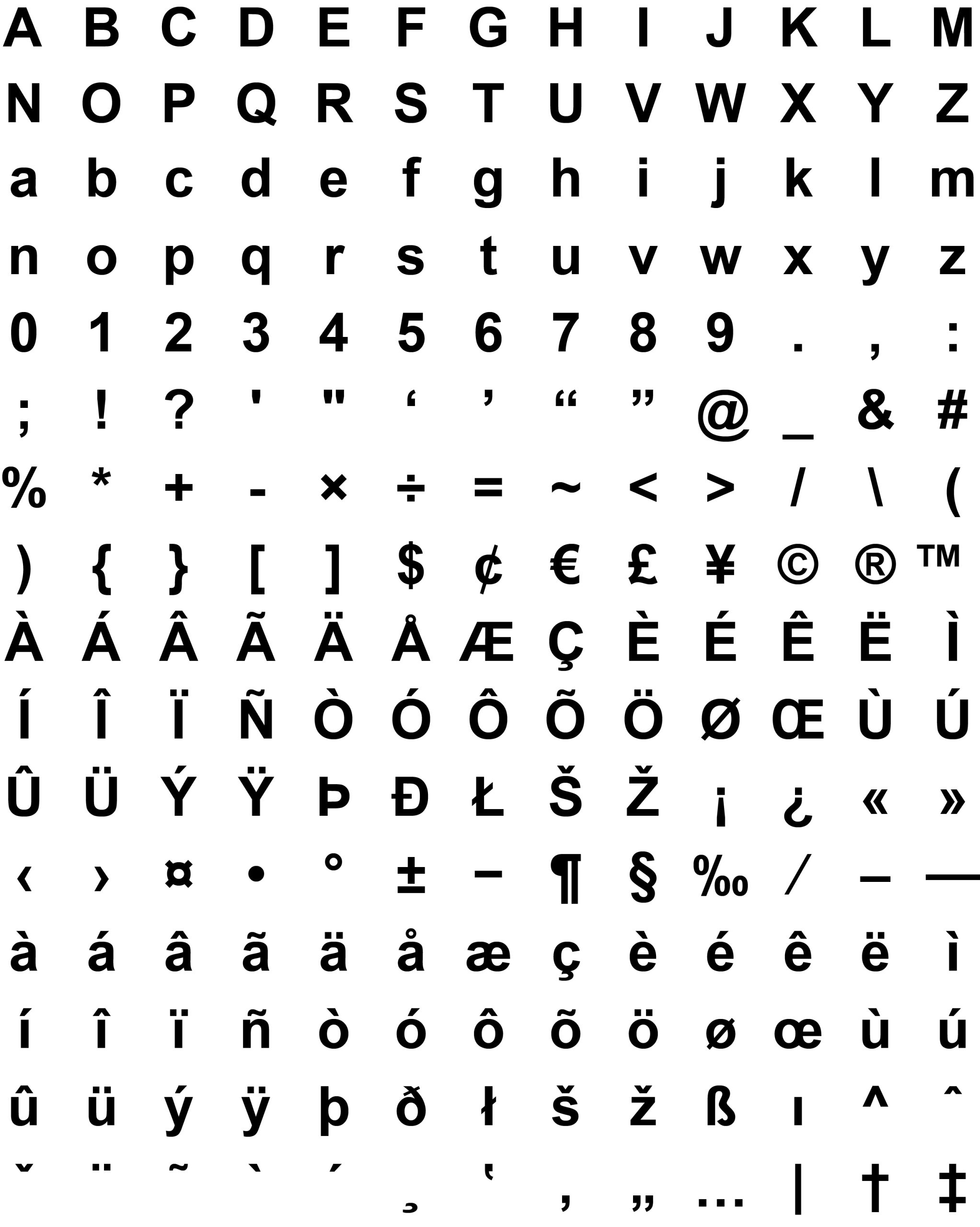
ISU Mantra: Helvetica (Regular)
2. Administrative & Academic Correspondence
For official documents, the focus is on professional readability and a “stately” feel.
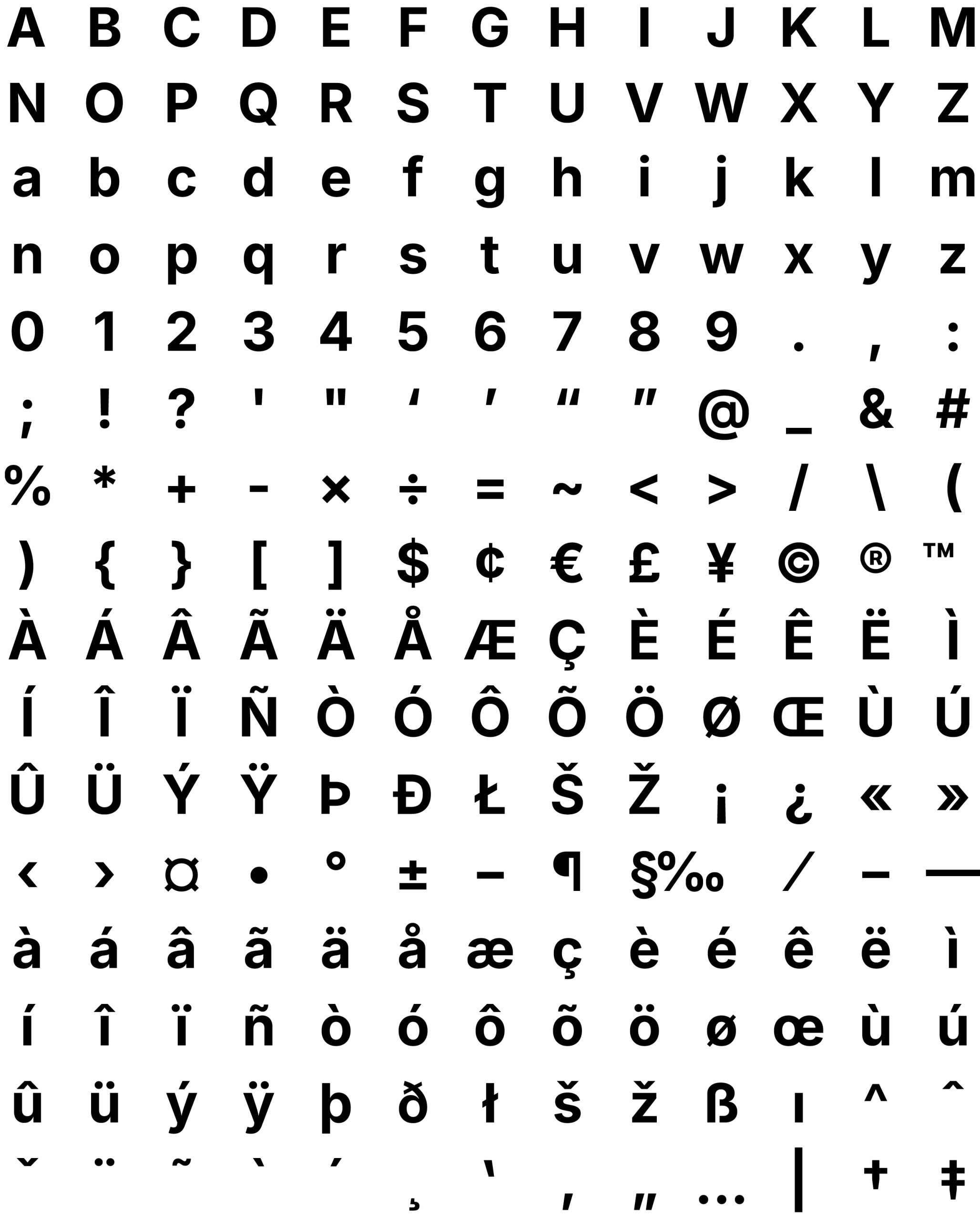
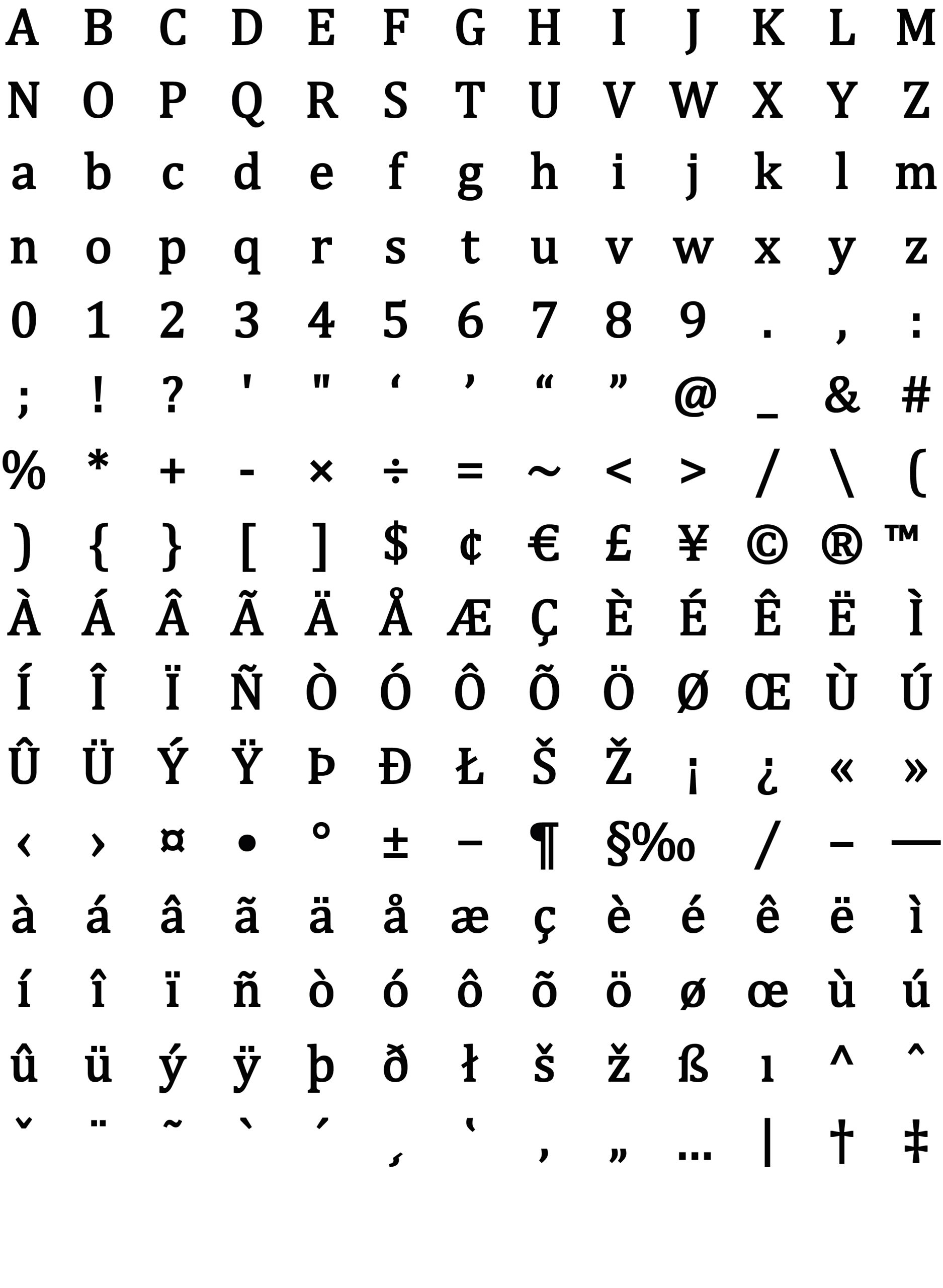
Titles & Headings: Inter
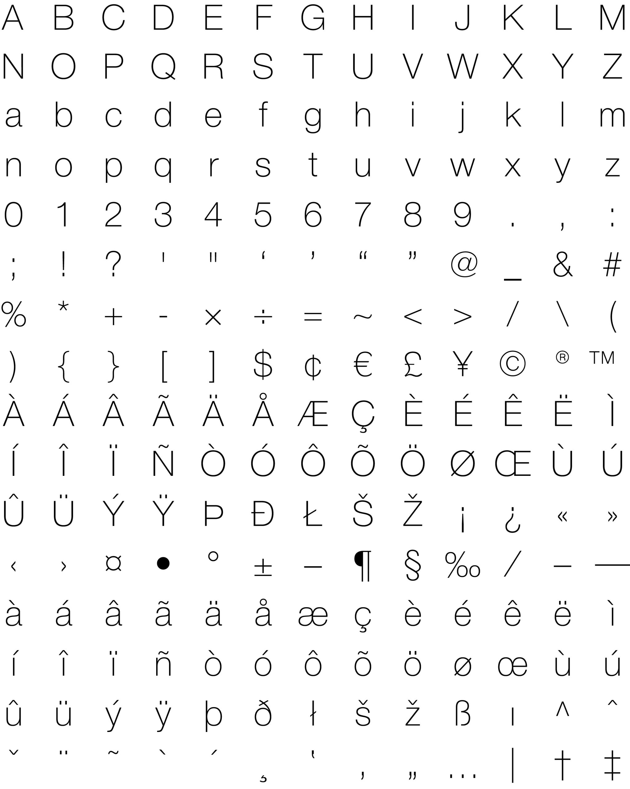
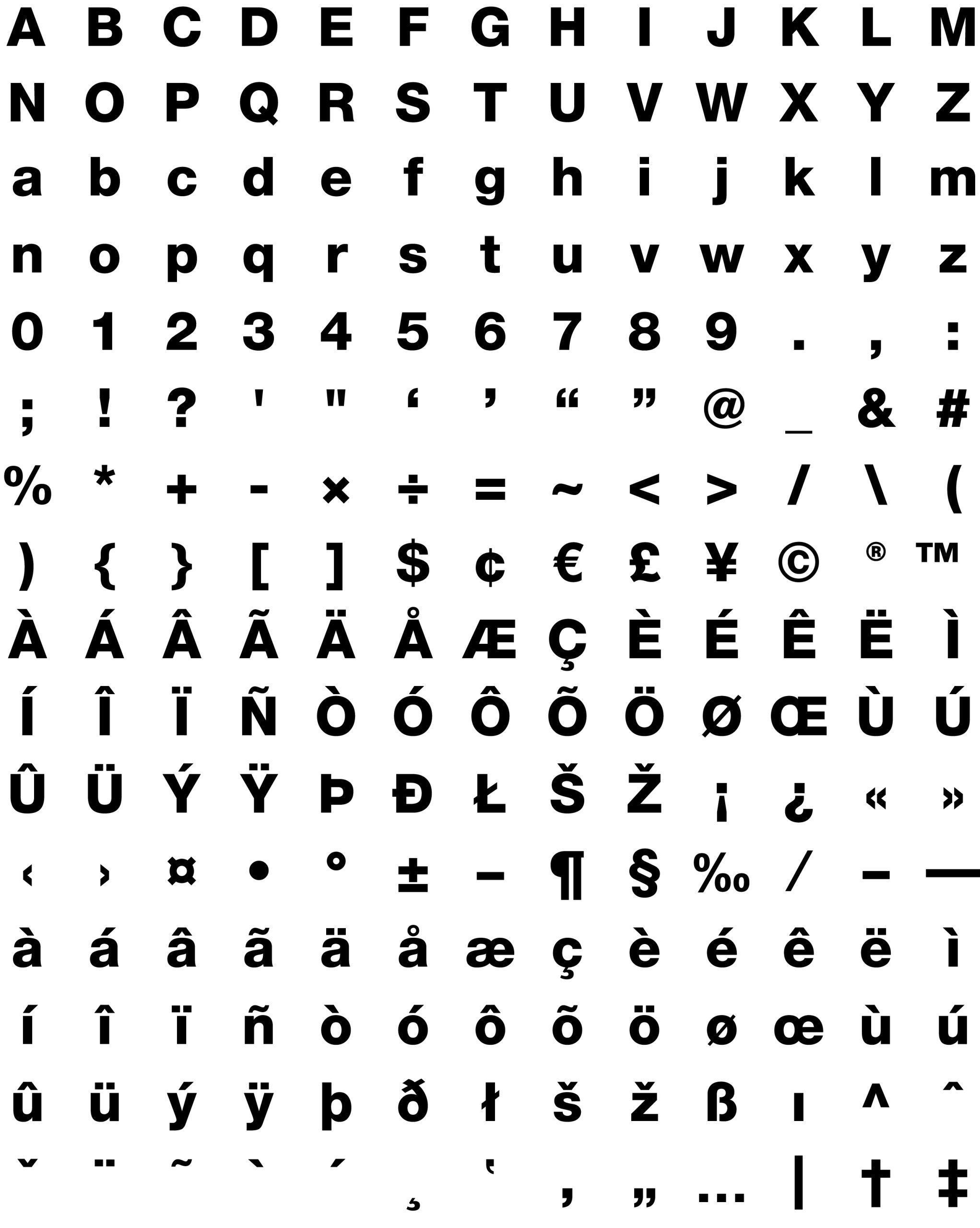
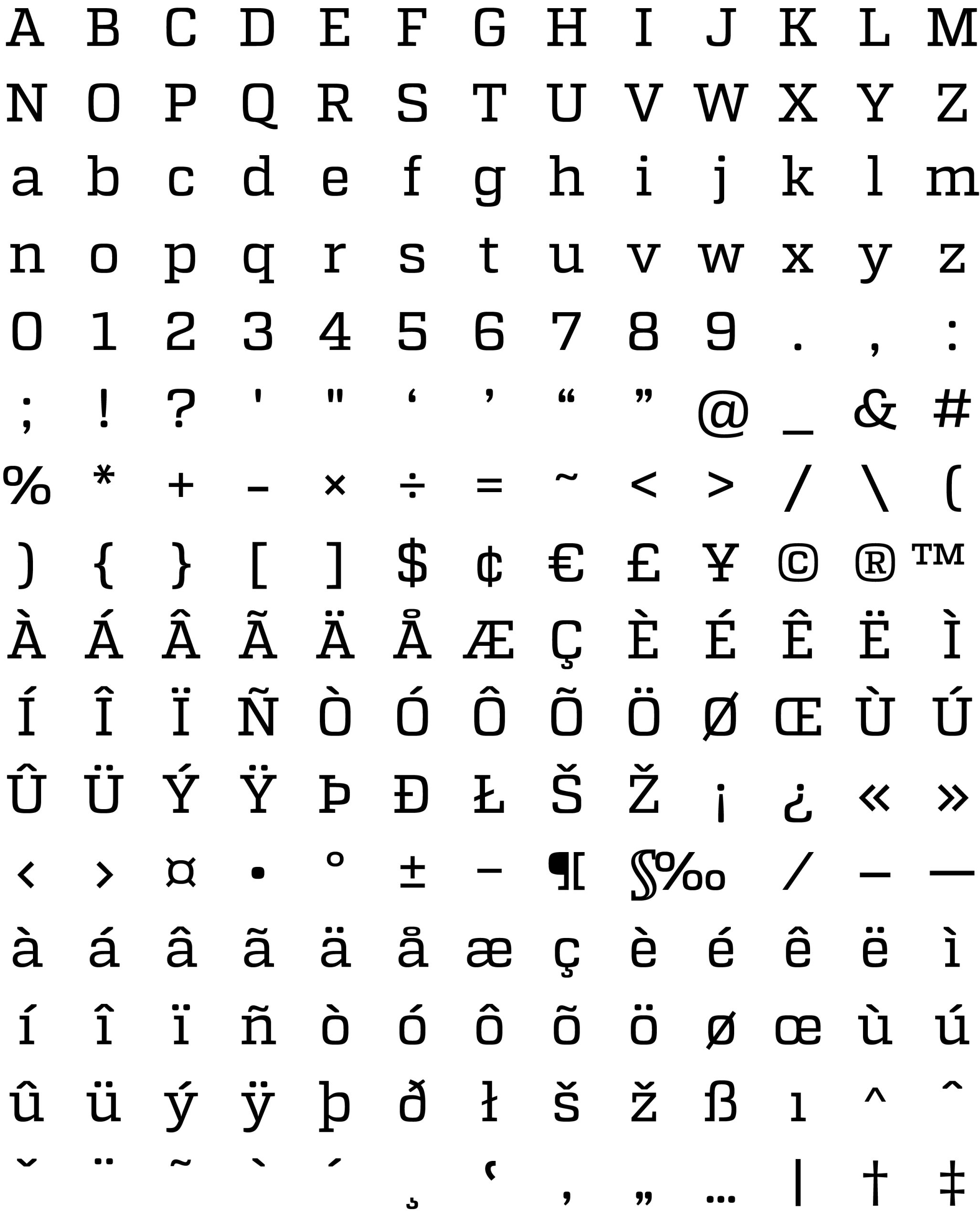
Body Text & Content: Cambria (Regular); Cambria (Bold) for datelines, names of officials, among others.
Recommended Additions: Use these for Memoranda, Research Proposals, Research Journals, Annual Reports, Diplomas, Certifications, and Form Letters.
3. Digital, Web Interface, and Creative Designs
Designed for the screen, these fonts ensure the ISU website and social media are accessible and user-friendly.
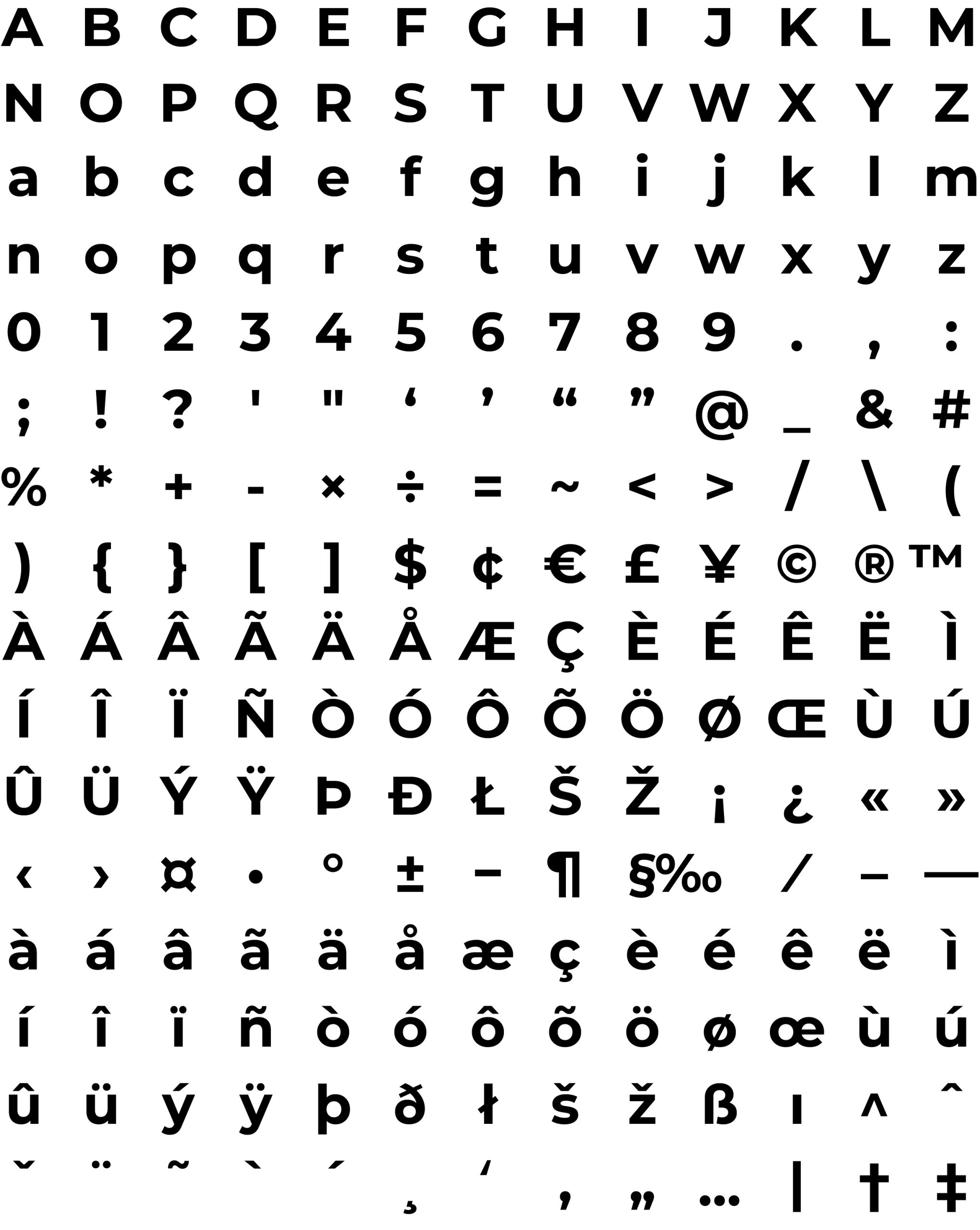
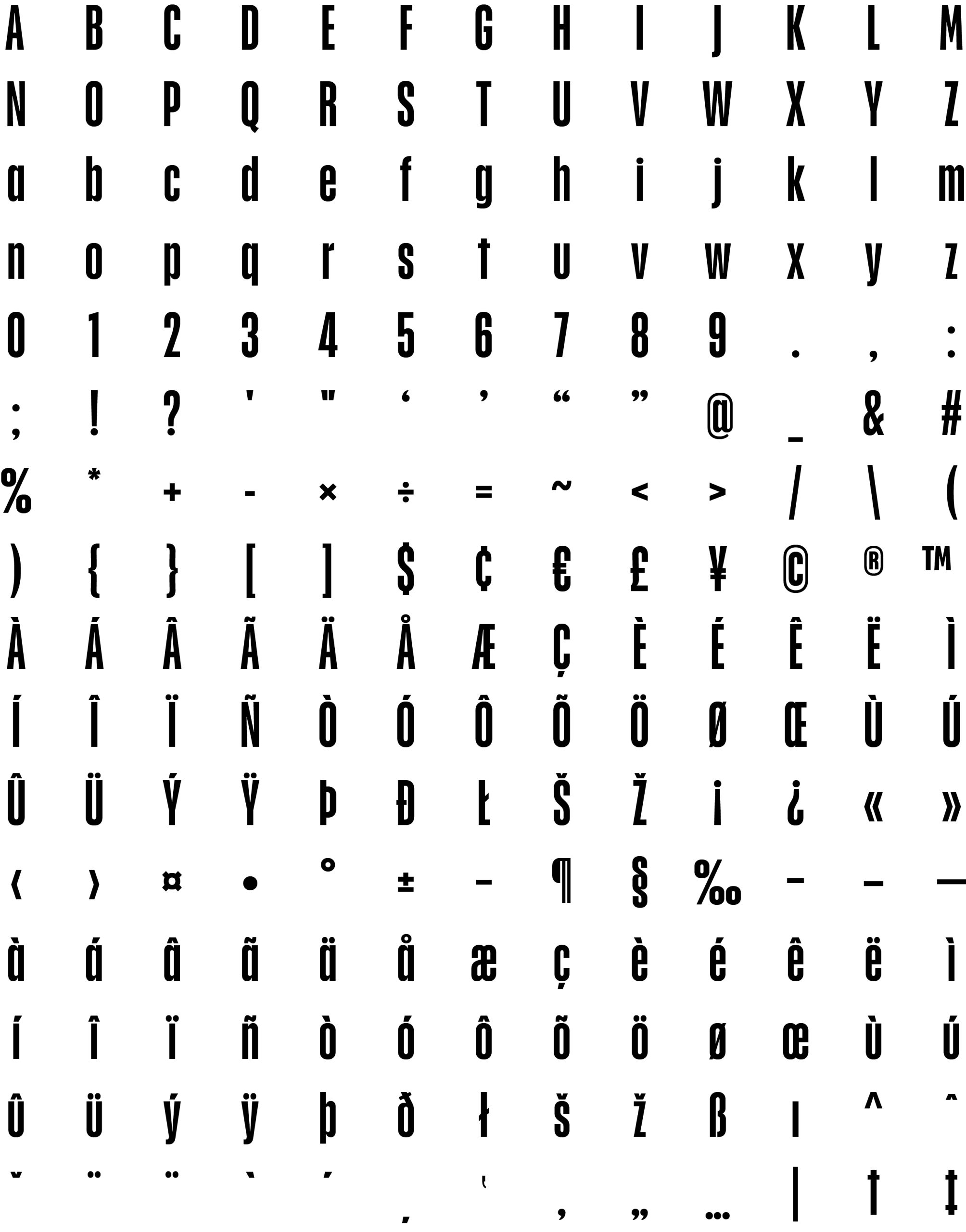
Headers: Montserrat (Bold) and Heathergreen
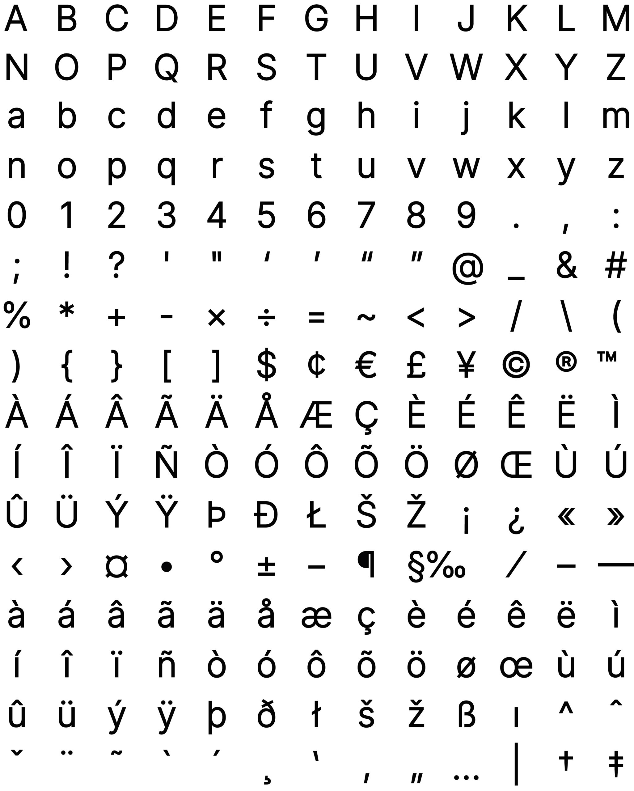
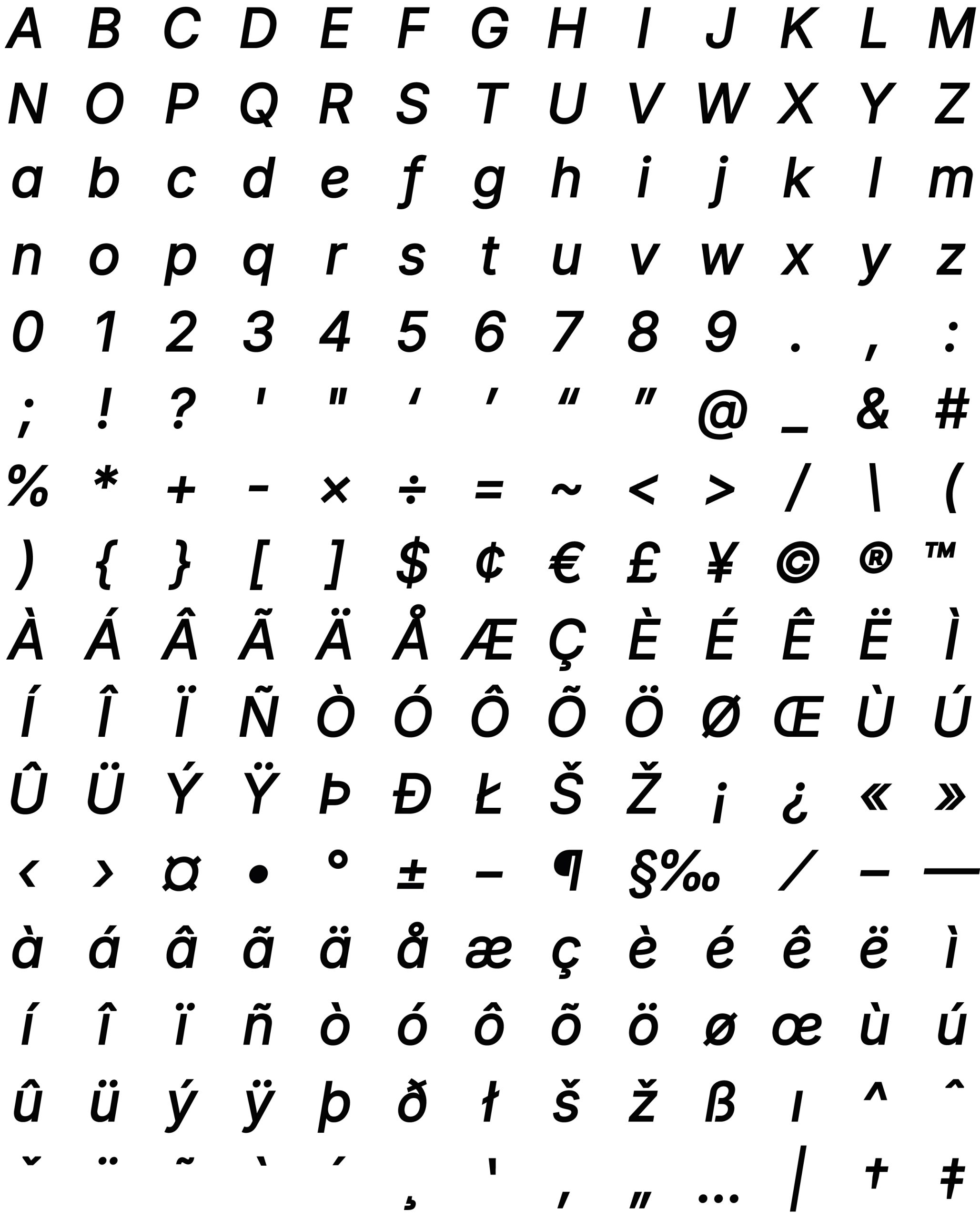
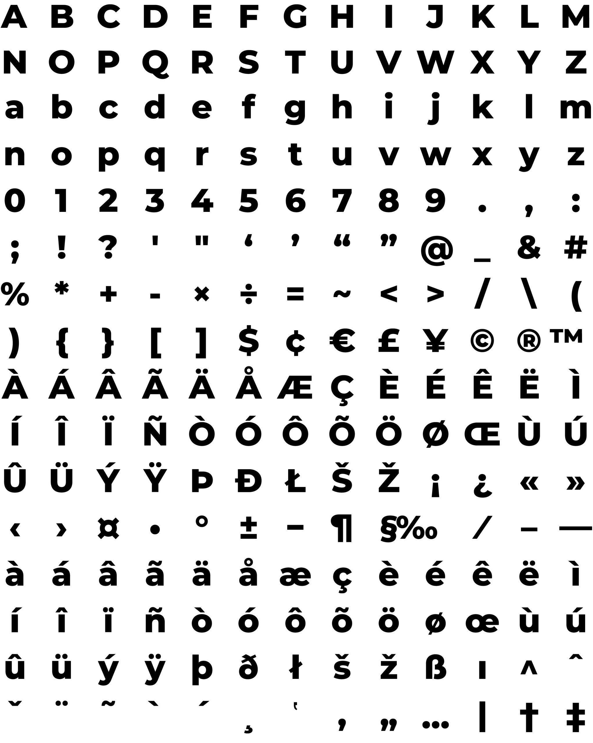
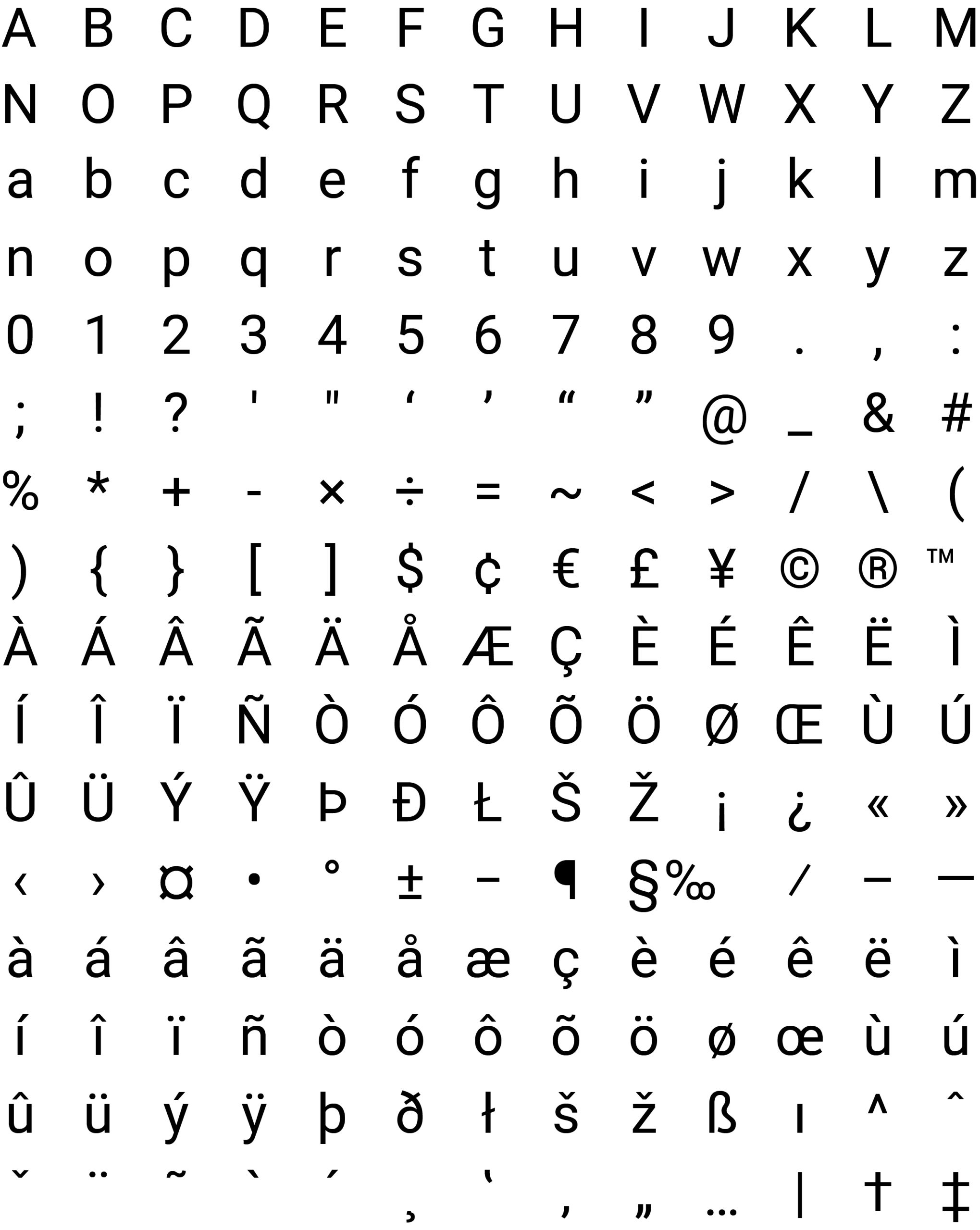
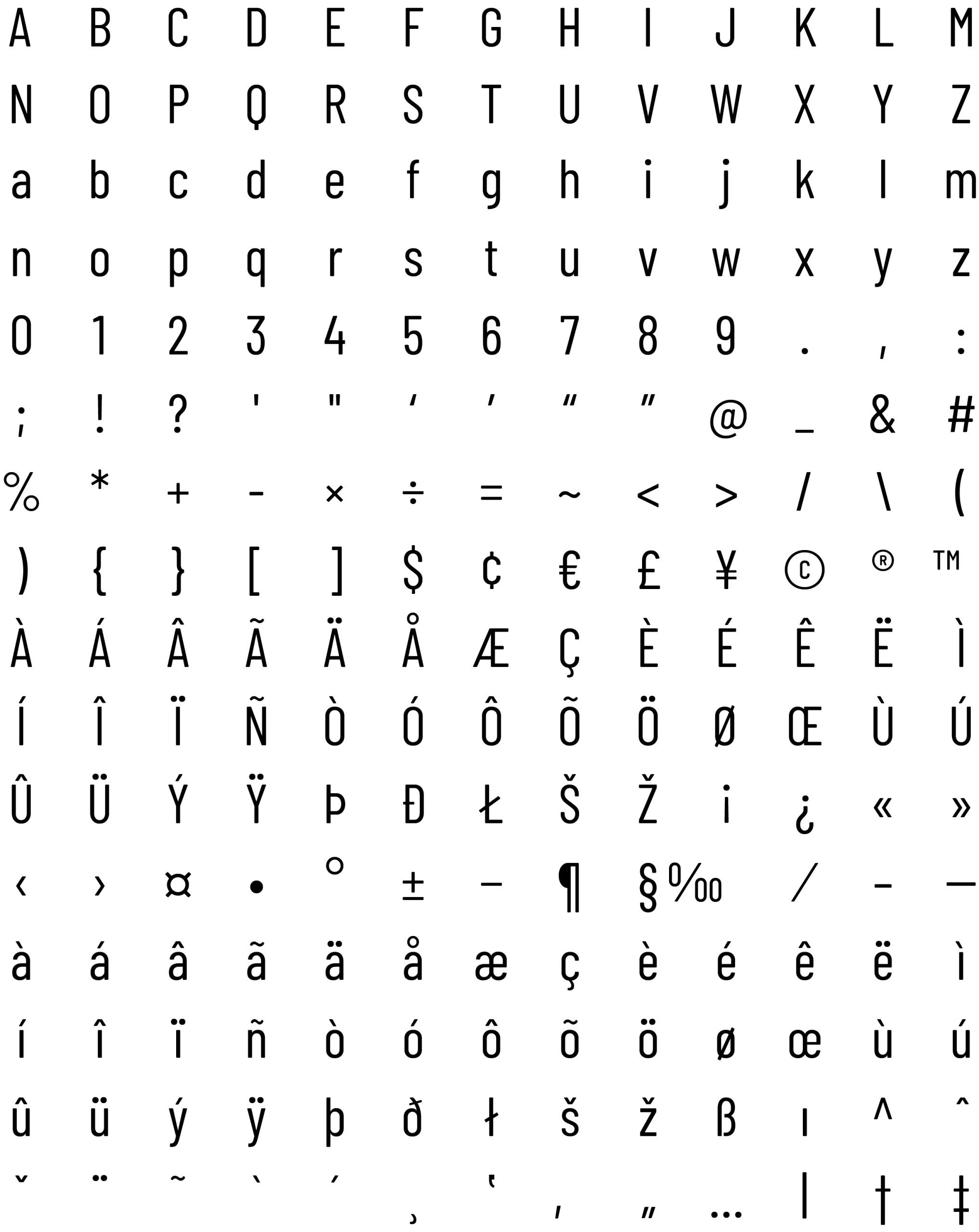
Text Content: Poppins – For long-form digital reading.
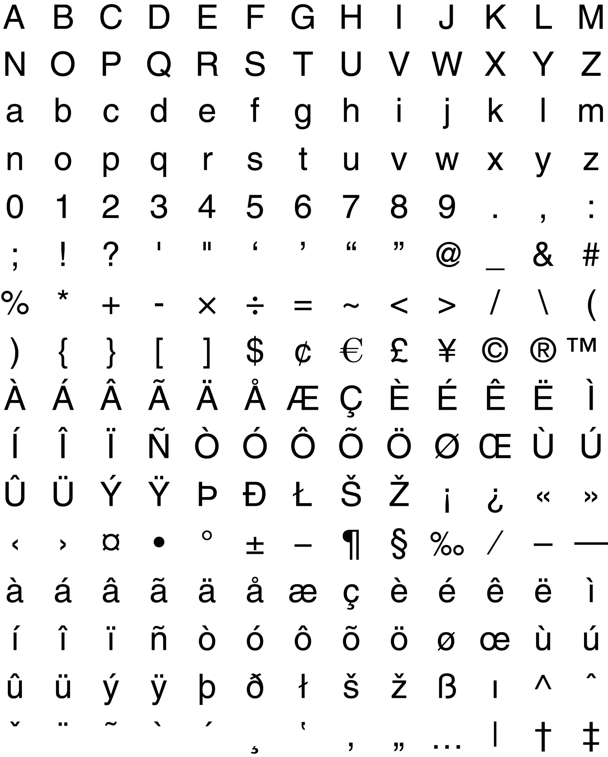
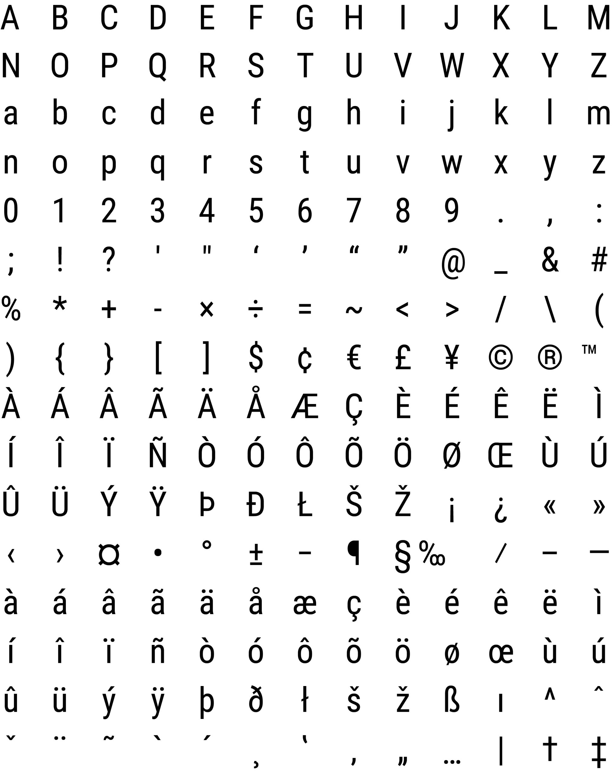
Reserve/Metadata/Supplemental: Roboto, Helvetica Neue, and Placard Next– For captions, sidebars, or system-level information.
Accent Fonts (Print & Digital)
Used sparingly for posters, event invitations, and certificates to add “flair.”
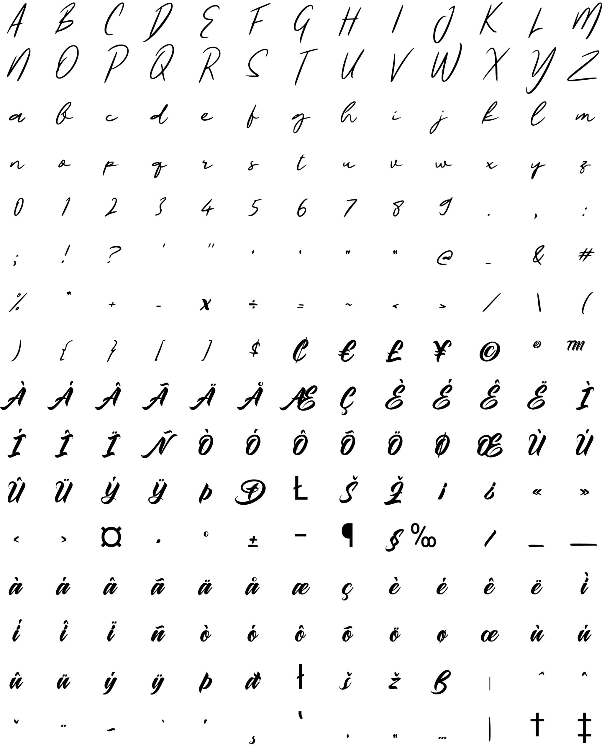
Maghrib.
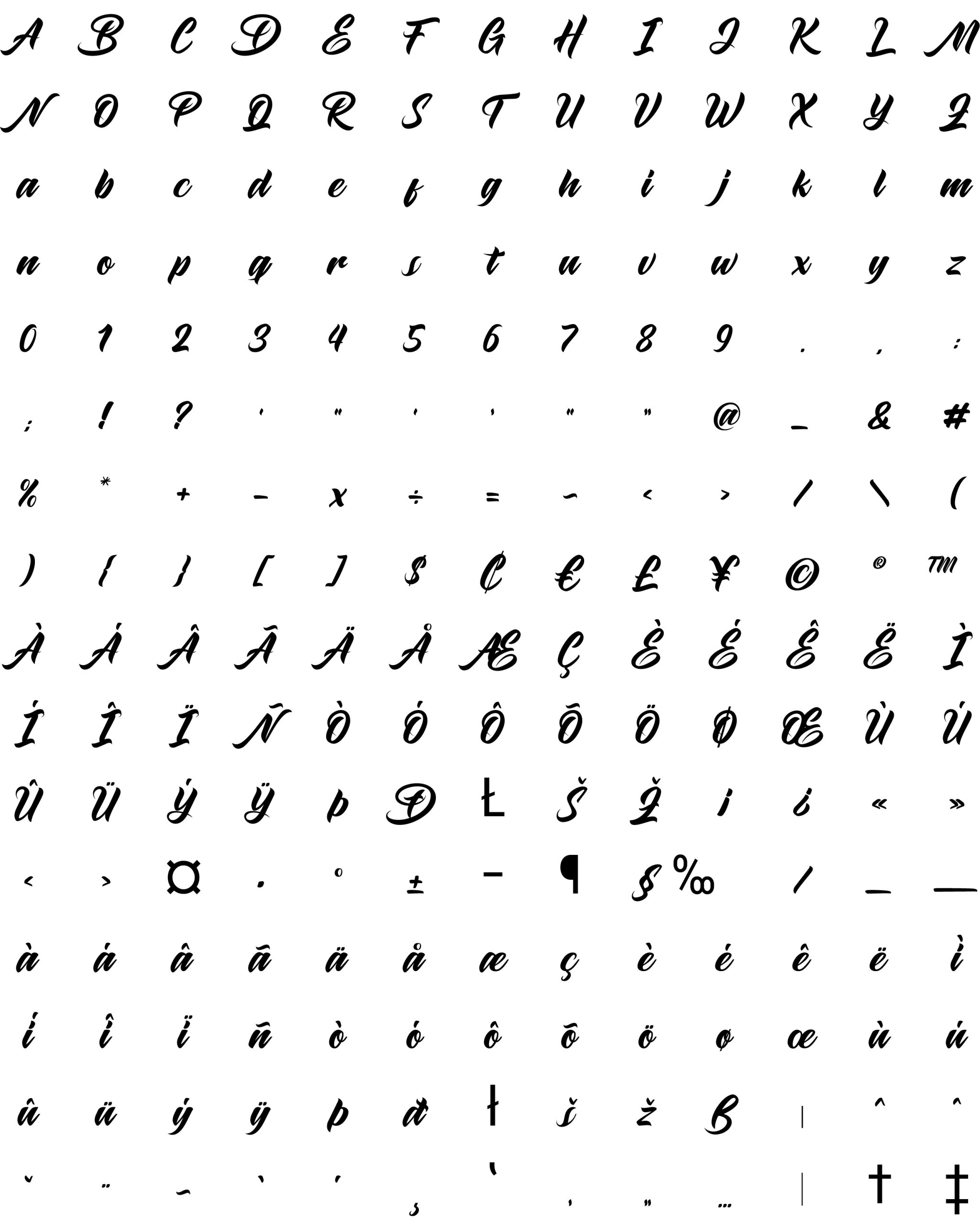
L. Langero Signature – For a personal, high-end touch.
4. Athletics & Sports Publication
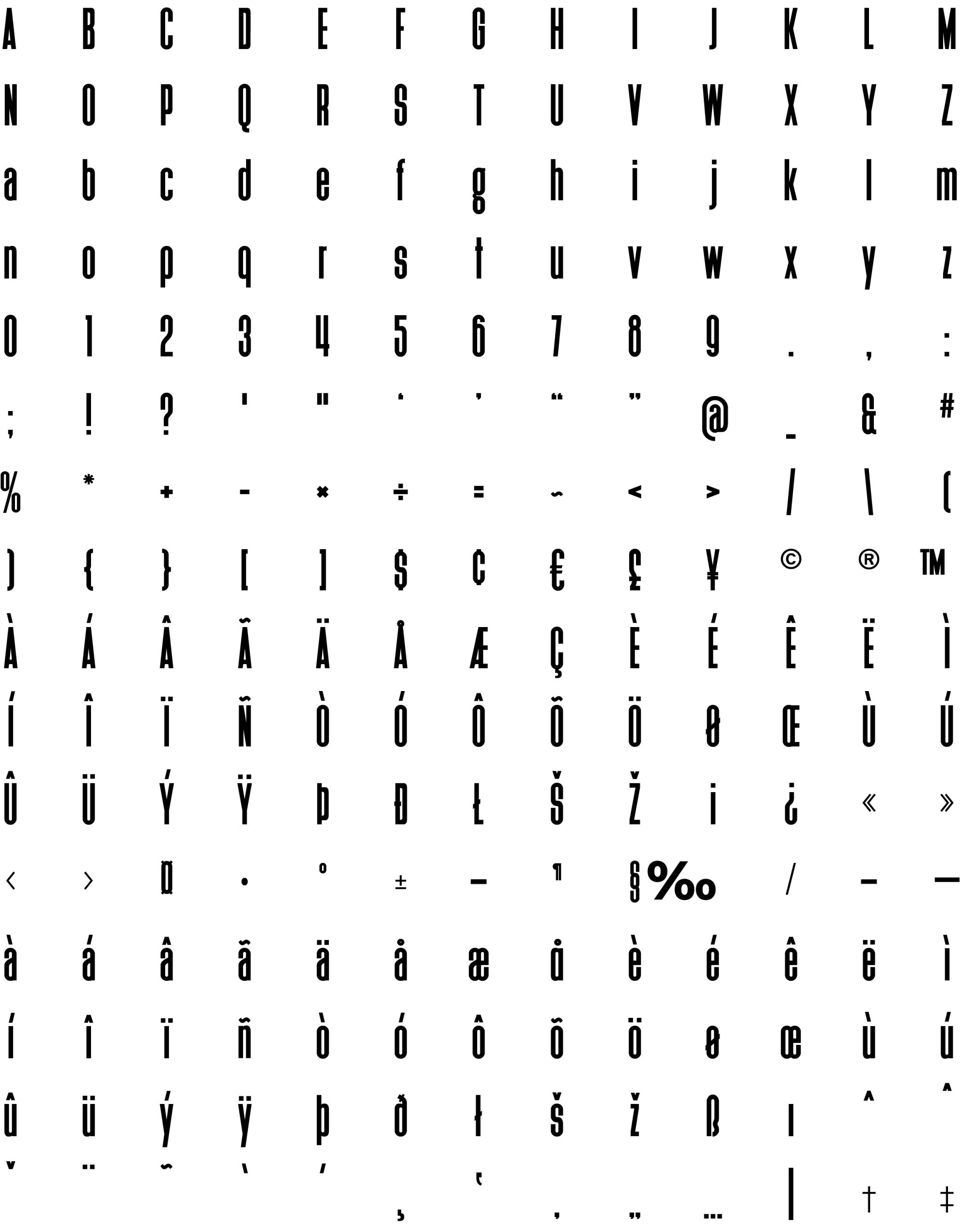
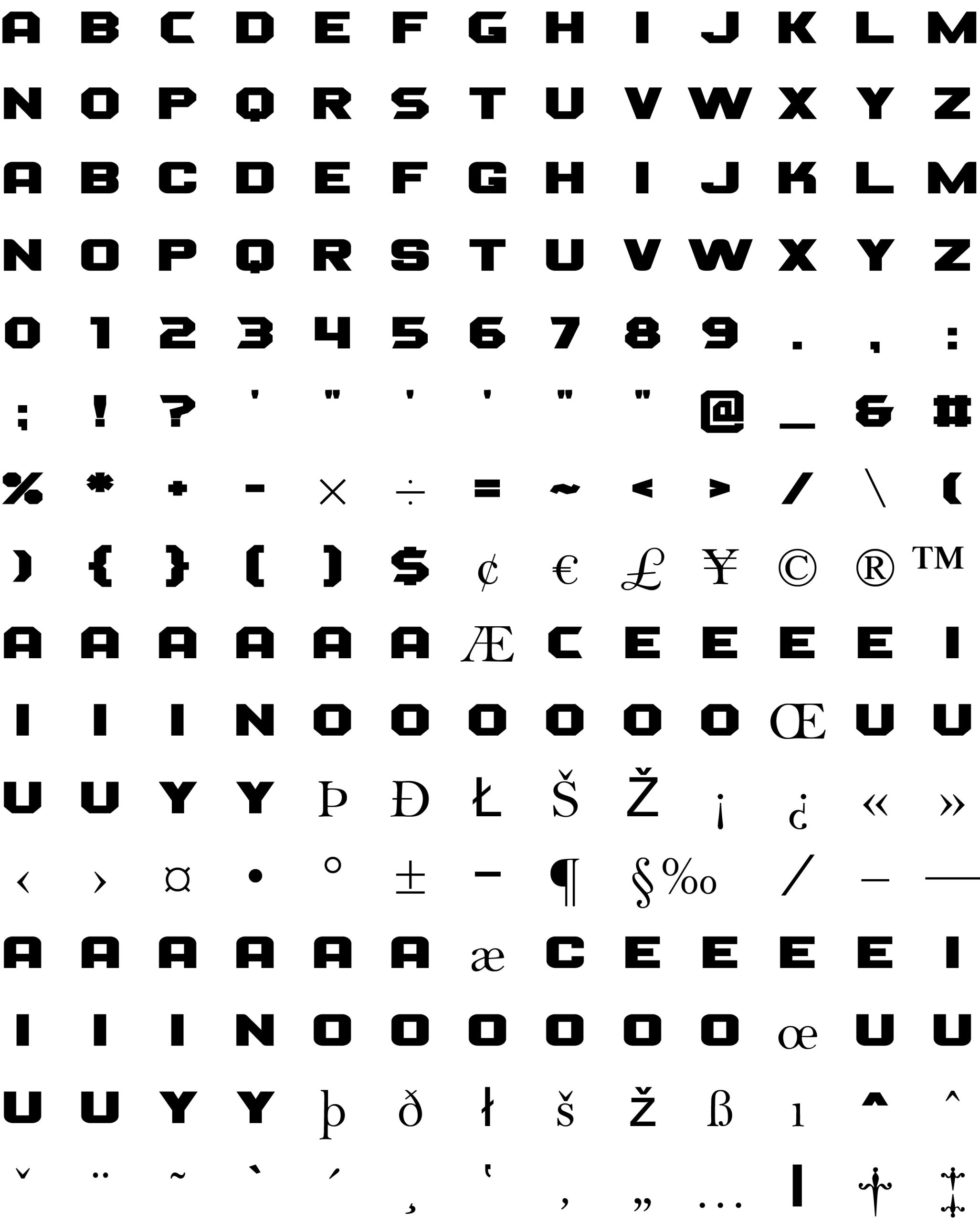
Primary Sports Font: Heisman (for a classic “varsity” feel).
Alternative: Barlow Condensed and Atletico.
University sports branding needs Condensed Bold fonts. They look “fast,” aggressive, and fit well on jerseys and scoreboards where horizontal space is limited.